In the early days of health tech, we were obsessed with “more.” More data, more tracking, more notifications – more “optimization.” But as we move through 2026, the industry is hitting a wall of optimization fatigue. Users are no longer looking for a digital drill sergeant; they are seeking a partner that is intuitive and easy to follow.
That’s where empathetic UX comes in. To my mind, it’s far more than a design buzzword. It is a practical framework for building digital experiences that respect a user’s emotions, energy levels, and limitations, especially in the wellness sector, where trust and motivation are fragile.
In this article, I’ll share how our design team approaches empathetic UX for wellness consumers and what you can apply to your own products.
Designing for the Nervous System: Beyond the Screen
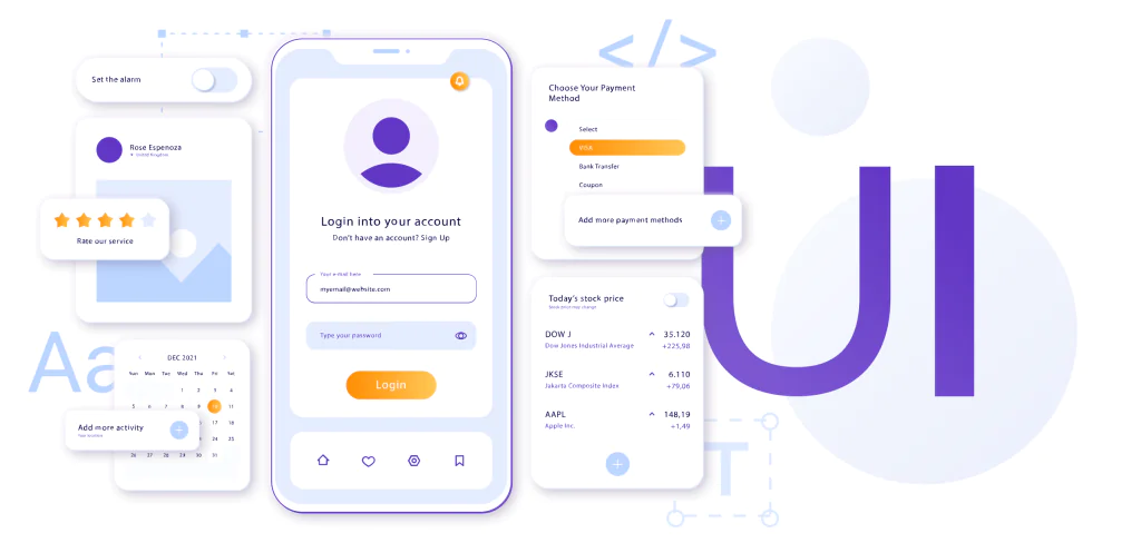
In 2026, we’ve moved beyond screen-first thinking and entered the era of Experience-First Design. For a wellness consumer, the interface is an extension of their environment. If they are using a mental health app at 11:00 PM, for example, because they can’t sleep, a bright, high-contrast UI isn’t just a poor design choice –it’s a biological stressor.
At Devtorium, we practice Context-Aware Design. Research in bioadaptive and emotion-aware interfaces between 2021 and 2026 shows that interfaces should no longer be static; they increasingly adapt to the user’s physiological and emotional state.
Circadian-responsive UI. We can implement logic that shifts color temperature and contrast around local sunset, reducing evening blue-light exposure and better supporting users’ circadian rhythms, rather than offering a simple Dark Mode toggle.
Biometric-aware UX. By integrating Apple HealthKit or Google Fit, interfaces can respond to stress-related signals, such as changes in heart rate variability or recovery trends, surfacing a “Quick calm” or simplified view rather than overwhelming users with dense visualizations when they are under strain.
Grounding micro-interactions. We design haptic micro-interactions – gentle, low-frequency pulses or breathing-paced patterns – that support nervous-system downregulation and a sense of physical grounding during high-stress moments.
The “Trust Paradox” and Ethical Data UX
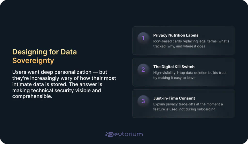
Trust is the most expensive currency in wellness. You are asking users for their most intimate data – their sleep patterns, their heartbeats, their anxieties. This creates what we call the “Trust Paradox”: users want deep personalization, but they are increasingly wary of how their data is tracked and stored.
To solve this, empathetic UX must prioritize Transparent Architecture. According to Gartner’s 2026 Strategic Trends, Confidential Computing is a top strategic trend – a technology that protects data even while it’s being processed. From a design perspective, we must make this technical security visible and comprehensible to the user.
How to Design for Data Sovereignty
Instead of burying privacy in legalese, wellness products should adopt these three “Empathy Patterns”:
- Human-Readable Privacy Labels: Replace 40-page legal terms with “Privacy Nutrition Labels”. Use simple, icon-based cards that explain exactly what is being tracked (e.g., heart rate), why (e.g., to detect stress), and where it goes (e.g., remains on-device).
- The Digital “Kill Switch”: We advocate for a high-visibility “Kill Switch” on the home screen or in the profile. This feature lets users delete sensitive logs or pause tracking instantly with a single tap. By making it easy to leave, you actually make the user feel safer staying.
- Active Consent, Not Passive Acceptance: Move away from “Accept All” banners. Instead, use Just-in-Time Consent. When a user first uses a specific feature (like sleep tracking), explain the value and the privacy trade-off right then and there.
Empathy in data means giving power back to the user. When the interface ensures the algorithm supports rather than dictates their decisions, engagement transforms into long-term loyalty.
Moving from “Actions” to “Intent”
Traditional UX focuses on actions: click here, buy this, log that, etc., while empathetic UX focuses on intent. When someone opens a fitness app, their action is “logging a workout,” but their intent is “feeling capable.” If they missed a day, a traditional app might send a guilt-inducing alert: “You’ve lost your streak!” An empathetic design recognizes the human behind the data. It might say: “It looks like you’ve had a busy few days. Would you like a 5-minute ‘reset’ stretch instead of your usual routine?”
Three Levels of Emotional Design
To build this kind of deep connection, we look to the framework introduced by Don Norman in his work, Emotional Design. He identifies three distinct levels of cognitive and emotional processing that dictate how a user bonds with a product:
- Visceral Design: This is the immediate, sensory reaction. In wellness, it’s the “calm” of the interface – the soft gradients, the rhythmic haptics, and the lack of clutter that lowers a user’s cortisol the moment they open the app.
- Behavioral Design: This is about performance and usability. It’s the pleasure of an app that “just works” – where the navigation is so intuitive it feels like an extension of the user’s own thought process.
- Reflective Design: The lasting impression the product leaves – how the experience shapes the user’s sense of identity, values, and self-perception long after they’ve put the phone down.
By focusing on Intent, we target the Reflective level. We aren’t just helping someone track a calorie; we are helping them build a positive identity. This shift is what drives long-term retention. When a user feels that a digital touchpoint truly “understands” their life context, they stop viewing the app as a tool and start viewing it as a partner. This is how you build a “sticky” product in 2026 – not through “shame-based” streaks, but through human-centric validation.
The Future of Empathy: Generative AI with a Heart
We cannot talk about 2026 without addressing AI. But for many, “AI” still sounds like the opposite of empathy – cold and calculating. At Devtorium, we are actively exploring how to bridge this gap, moving beyond transactional chatbots toward EQ-AI (Emotionally Intelligent AI).
The goal is to move away from robotic scripts and toward models that are guided by established clinical empathy frameworks. One of the most effective is the NURS model, which provides a structured approach to acknowledging and validating user emotions.
Imagine a user logging a workout failure; instead of a generic “Keep going!”, an EQ-AI system recognizes the frustration in their tone. It doesn’t just push data; it offers a restorative alternative, such as a guided breathing session or a gentle stretch. This isn’t just “smart” software – it’s a design that understands the human condition and responds with the nuance that wellness demands.
The Practitioner’s Playbook: How to Build for Empathy
Designing for wellness isn’t a “one and done” task; it’s a continuous refinement of the relationship between the user and the interface. Here is how we approach building these touchpoints.
Step 1: Conduct an “Emotional Audit”
Before you look at user flows, look at user moods. We use an Empathy Map, but we adapt it for health tech. Instead of just asking what the user does, we ask:
- What is their “Baseline Anxiety” when they open the app?
- What is the “Worst Case Scenario” interaction (e.g., receiving bad lab results or missing a goal)?
- Does our notification sound like a friend or a debt collector?
Step 2: Implement “Gentle Friction”
In traditional e-commerce, friction is the enemy. In wellness, friction is a protective layer.
- The Confirmation Pause: If a user is about to delete an entire week of health data in a moment of frustration, we don’t just provide a “Delete” button. We add a pause: “You’ve made great progress this week. Are you sure you want to clear this? You can also just hide it for today.”
- The Screen-Time Guard: If our analytics show a user has been in the app for more than 15 minutes, we trigger a subtle UI change – perhaps a softer background or a small note suggesting they take a break from the screen.
Step 3: Language Localization & Tone Check
Wellness is culturally sensitive. What feels “motivational” in the US might feel “intrusive” in Europe.
- Micro-copy Matters: Replace clinical terms like “Data Input” with human terms like “Daily Reflection.”
- Grammar for Empathy: Avoid the passive voice. Use active, supportive language. Instead of “The goal was not met,” use “You didn’t quite reach the goal today, and that’s okay. Tomorrow is a fresh start.”
The “Anti-Pattern” Gallery: What to Avoid
As a design team, we’ve learned as much from what not to do as from our successes. To maintain a truly empathetic touchpoint, you must ruthlessly eliminate “Wellness Dark Patterns”:
- The Infinite Scroll: Wellness apps should have an end. When the user has finished their meditation or checked their vitals, give them a “Success” screen that serves as a digital exit.
- Notification Bombardment: In 2026, the “Red Dot” notification is a stress trigger. We advocate for “Summary Notifications” – one meaningful update per day rather than twenty micro-pings.
- The “Shame” Loop: Never use negative reinforcement to drive engagement. If a user stops using the app for a week, don’t send a “We miss you” email that feels like a guilt trip. Send a “Welcome back, we’re here when you’re ready” message.
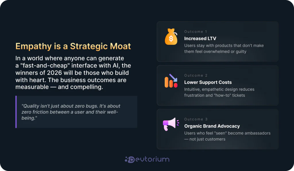
The Business Case: Why Empathy Wins
Is empathy just a “feel-good” concept? No. It’s a strategic moat. In my experience leading design teams, the business outcomes are measurable:
- Increased LTV (Lifetime Value): Users stay with products that don’t make them feel overwhelmed or guilty.
- Lower Support Costs: Intuitive, empathetic design reduces “how-to” questions and user frustration.
- Brand Advocacy: Wellness is deeply personal. When a user feels “seen” by a product, they don’t just use it – they become organic ambassadors for the brand.
Halo Lab’s 2026 UX trends highlight how unified ecosystems with empathetic touchpoints drive stronger long-term patient engagement over fragmented trackers.
Conclusion: Quality is the Moat
In a world where anyone can generate a “fast-and-cheap” interface with AI, the winners of 2026 will be those who build with heart. At Devtorium, we believe that by designing for the human nervous system and respecting emotional boundaries, we aren’t just shipping code – we are contributing to a healthier digital future.
Quality isn’t just about zero bugs; it’s about zero friction between a user and their well-being.
Let’s Build the Future of Wellness Together
Are you looking to transform your health-tech MVP into a human-centered experience that users actually love? At Devtorium, our design team specializes in blending high-performance engineering with empathetic UX strategies. Contact us today to schedule a design audit or explore our Health-Tech Case Studies to see how we’ve helped brands like yours lead the wellness market.