Table of contents
As a client ordering any UX and UI design services, you need to understand that while personal views on aesthetics matter, designers must not rely on them alone. Professionals adhere to the core UI design principles to create a final product that’s both usable and attractive. Simply put, those principles exist to ensure that users love any solution or website you launch.
Keep reading to learn what those core principles are and some special secrets of the trade shared by Devtorium’s UX/UI design team.
Core UI Design Principles Explained
Focus on the User
The user must be the center point of all UX and UI design. It means that every step of the way designer’s first thought must be, ‘what will be most convenient for the user?’
A good interface doesn’t confuse or distract from the goal of the product. Essentially, all UI design principles focus on making the interface easy and pleasant for people to interact with. A person who opens the app for the first time must be able to find exactly what they need without any guides or additional training. Using it must feel natural, so having the user as a focus of the design is an absolute must.
Another critical factor is that the user must feel in control when using the app. Therefore, UX and UI design must be created in a way that’s easy to master fast. The user should feel confident in their ability to find and do what they need, so the interface must be intuitive.
Moreover, user-focused UI design must allow for mistakes. For example, it means that all actions must be reversible. In addition, any important steps must literally come with a warning.

Clarity
Clarity is one of the essential UI design principles today. Never forget that any interface’s purpose is to enable the user to interact with an app. Therefore, they must be able to clearly see what they need to do in order to achieve their goals.
Simply put, clarity of the interface determines whether people using your app are able to do this at all. Poorly designed UI makes it impossible for people to understand what your application does.
However, it’s also important to remember that no specific clarity standard exists. Actually, it will differ significantly depending on the purpose of the app. For example, if you are designing an eCommerce app for a large marketplace, you’ll have to include complicated catalogs with multiple categories and sub-categories. Meanwhile, a basic note-taking app will be much simpler and ‘clearer’. Therefore, as a client, you’ll need to work closely with the UI/UX design services team to create a clear and understandable interface for your target audience.
Consistency
Keep everything consistent! It’s not only one of the main UI design principles but the golden rule of design as a whole. Consistency makes your app more aesthetically pleasing and easier to use and understand. Also, it’s necessary for effective branding throughout all your channels.
In addition, you need to remember that not only your design must be consistent with the brand’s style. You also need to make it consistent with symbols and terms used in various real-life situations. For example, as an eCommerce business, you might want to stand out and make your shopping cart appear in some unique way, discarding the traditional cart or basket design and even renaming the feature.
If you are expecting the result to be that your clients will appreciate how unique your brand is, you will be bitterly disappointed. There might be a few who will genuinely appreciate it. However, most shoppers will simply leave your website fast because they couldn’t find the cart within a few seconds.
So, always remember to be clear and consistent in all your messages!

Simplicity and Minimalism
Simplicity and minimalism go hand in hand with clarity as leading UI design principles today. Classics are there for a reason, and that reason is that they are recognizable, understandable, and work exceptionally well. So, use that power to create UX/UI design that truly appeals to your audience.
In our world of information overload, minimalism has become equivalent to clarity. So, whether you like the style personally or not, it’s imperative to use it for any app interface design. Otherwise, your product’s chances of success are slim.
Feedback
UX and UI design must be interactive in a way that it must provide feedback to the user. Your UI copy will be responsible for that. So, design extends beyond graphics. The quality of the UI/UX copywriter’s work is no less important for making your app easy to use and understand.
A good user interface will provide prompts and feedback for every action to help users make decisions and master the app.
Accessibility
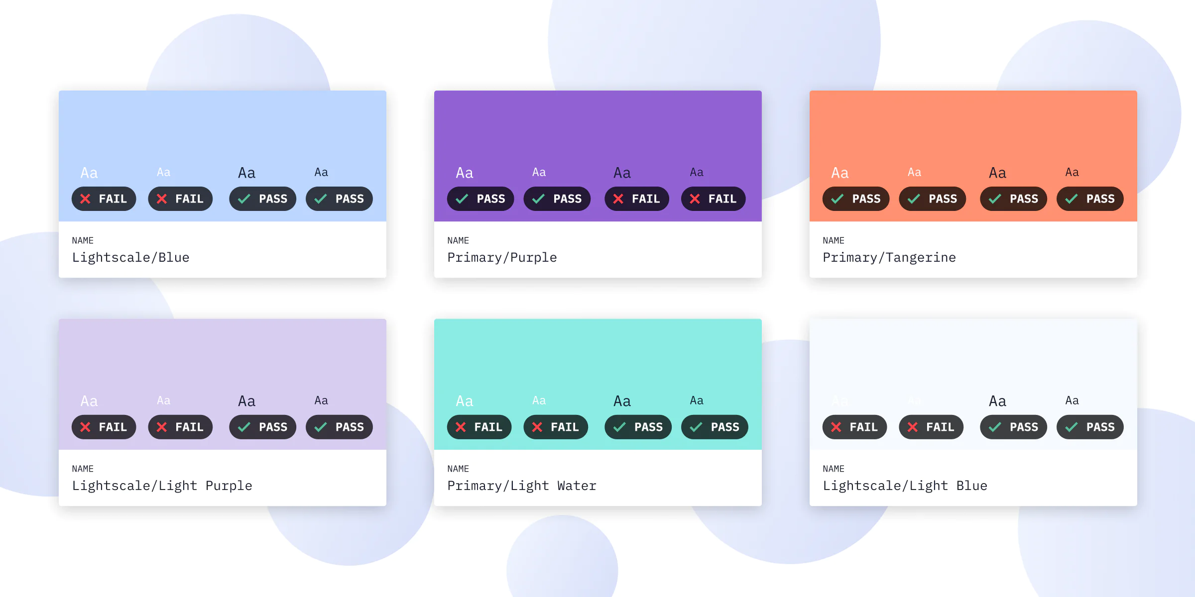
We are building an inclusive world, so accessibility is one of the core UI design principles today. However, not everyone is the same, and it’s the designer’s job to account for all types of user differences. It’s hard work to research and create an interface that will be equally comfortable for different people.
Adaptable and flexible interfaces that the user can adjust to their preferences are the main future trend. Also, remember that accessibility requirements will differ depending on the type of user interface.
Bottom Line: Always Prioritize UI Design Principles
It’s true that design is a matter of personal taste and preference. However, if you want your software product to be successful, you must consider the main UX and UI design principles. This way, you can ensure that the app is easy to use.
Keep these principles in mind when choosing a UI design company. In fact, the designers you consider hiring must know and adhere to these principles in their work. So, be sure to discuss this during the interview.


